UX Showcase
An initiative in effort to learn about existing opportunities for user experience improvement for a data company. This interview will help us better understand the challenges and limitations of the client and better understand what our partners are saying about the data cloud services.

Assessing the Current State
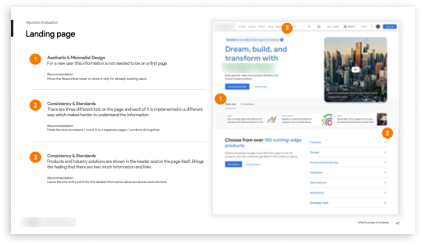
We started with a heuristic evaluation using Jakob Nielsen's 10 general principles for interaction design. We evaluated the current state of the cloud service platform to highlight the technical and usability issues. We focused on the landing page and the sign up experience because it is the front door of the entire platform experience.
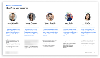
We talked to professionals of varying titles and backgrounds that would interact with the cloud service platform. We validated our personas with their insights. These personas were then used to model the customer journeys.
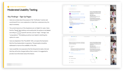
In addition to the heuristic evaluation and person a validation workshops, we also conducted usability testing. Our subjects were small business owners that are giving feedback on the current state of the cloud service platform. They gave us valuable insights on how people approach the cloud service platform with or without a technical background.
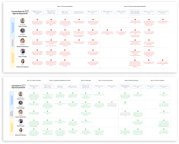
Customer Journeys
After all the research is conducted, the team synthesized the data and insights to create new customer experience flow.
Through the research we concluded:
Feedback indicated that the landing page seemed geared towards developers and lacked relevant information for a wider audience.
We observed mixed emotions regarding the language used in the "Credits" and "For Free" sections of the landing page.
Users are unclear about the purpose of the "Verification" section and would benefit from more explanation to help them understand why this step is necessary.
The current taxonomy of the dropdowns are not helpful for users. With this feedback we adopted changes that would alleviate these critical pain points.
Final Experience
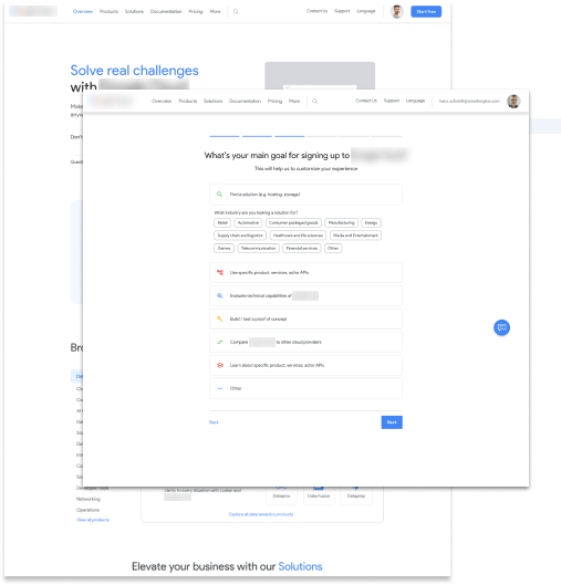
The team created 2 prototypes reflecting the journeys of a small business owner and a large company signing up for the cloud service. The new experience enhances:
Enhance promotional content and value-add of other GCP products on the landing page
Customize the content based on data input throughout within sign-up pages
Provide transparency throughout the sign-up page process, including adding clarity in the identification verification
Improve visual and content hierarchical throughout the entire journey
With another round of moderated usability tests with the same group of people, we validated our prototypes. We gathered positive feedback with potential opportunities.
Get in touch if I seem like a good fit for your project or team.
My inbox is always open if you have something you would like to discuss or just feel like saying hello.
Contact Me