Thunk
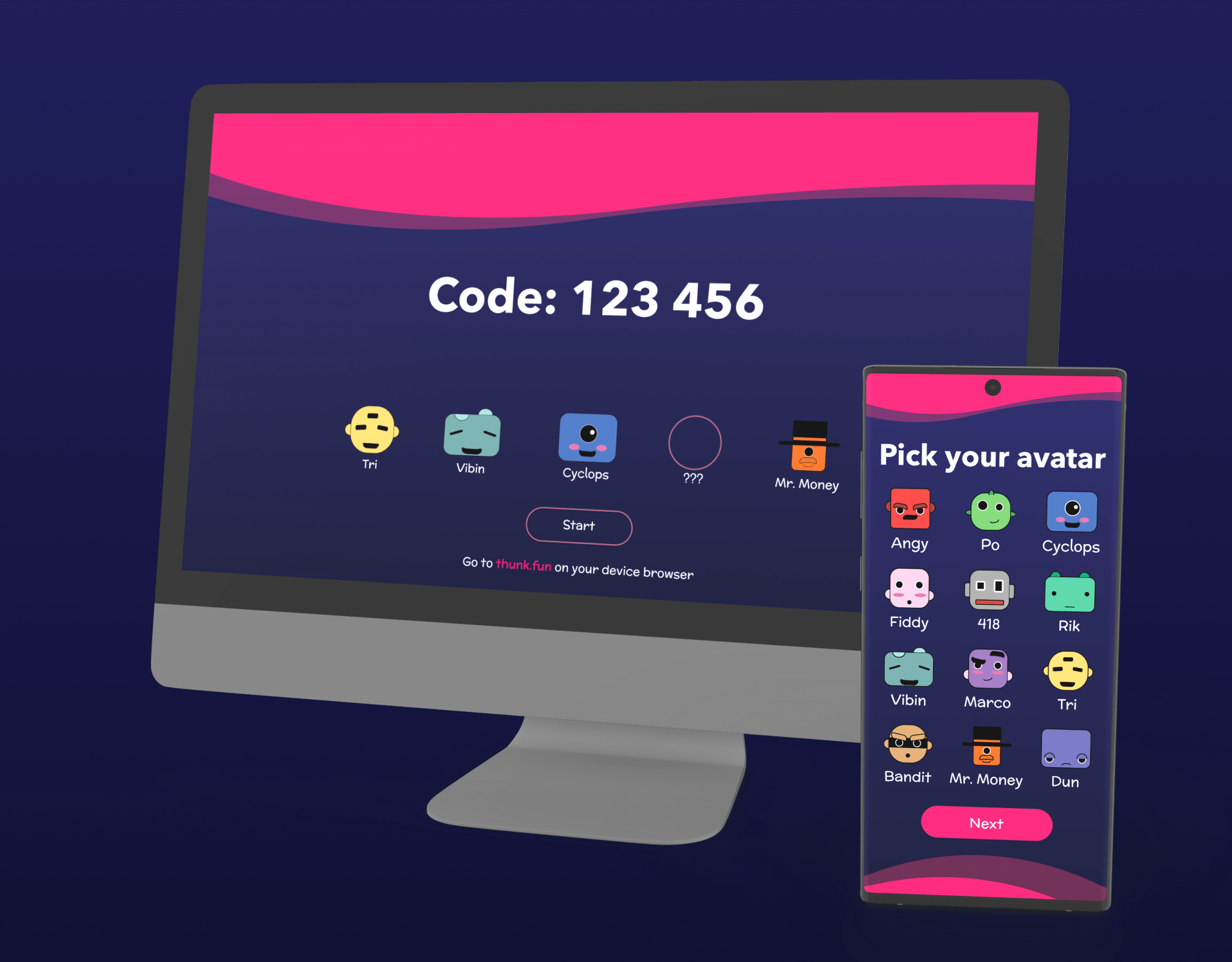
Thunk is a party game centered around creativity through divergent thinking.

What is thunk
Thunk is a game. Our team initially started with the idea of building a creativity enhancing game. In the beginning of the project the team decided that we did not want to set ourselves on a name just yet. It was our belief that choosing a name before even starting to develop the idea of the project would greatly hamper our direction. For the first few weeks we ran with the temporary name Project Dali, named after famed artist Salvadore Dali given this Dali was selected to embody the ideals of bizarre dreams and surrealism, though the latter idea was later dropped. We anticipated the final game would be focused on creative thought and pushing the party of users outside the box. As the project developed, we outgrew the temporary name Project Dali. After long internal discussions and narrowing down a pool of names Thunk was finally settled on to embody the mood of the game, creative and thought provoking yet still maintaining a fun attitude.
User Research
We started our research process by running Interest Interviews to ensure we were talking to users from day one of the project. We took part in a creative exercise conducted at the Rhode Island School of Design created by Industrial Design professor Cas Holman. Additionally, we gathered data as to what other party games like this people played regularly/with their friends and peers. While there was a decent spread of games that our interviewees played, there was a general interest in our project as it targeted creativity through divergent thinking.
From that information we made user personas to associate who the ideal player is. Each user persona we developed was created with our 18-25 year old college demographic in mind. Our three user personas wanted to not only flex their creative muscles. Some personas did not want an overly competitive game nor a game that is too complex or strenuous to setup. They also were looking for a game with a focus on social interaction and not just for points and winning. Our user personas echo our users and how they interact with Thunk as a whole.

Journey Maps
Taking these personas we designed user journey maps to better emphasize their high points and fix their low points. Each journey map was given a similar scenario where groups of college students wanted a game that requires little to no setup. Also, a game with gameplay based around creativity was something each persona felt most comfortable with, due to the lack of an overly competitive nature associated with the game. Thunk being a game that is playable on a phone from a host device streamlines the joining and playing process which makes our personas more than happy to join in and play Thunk. Our focus was on making each user’s journey similar to these journey maps, simplified and yet extremely fun to play, at a moment’s notice.

Expert Input
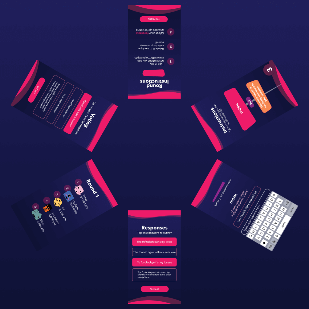
We interviewed two of our Game Design teaching faculty at Drexel University: Tony Rowe and Robert Lloyd. Tony gave us valuable feedback about our UXR methods involving playtesting and surveying. He suggested for us to use Likert Scales which give both easily digestible information about our game and make it so that the team can quantify change over time easily. By asking about how long players feel they were playing, we can better understand if the game felt fast or slow. We should be shooting for a time that is relatively faster than the actual game time, but not too fast. Too slow, and we can ascertain that players find the game boring. Too fast, and our game becomes unmemorable. Rob Lloyd pointed out that our game was “too normal”. This created a new challenge for us. We didn’t have any mechanics that really facilitated creativity, and Rob helped us brainstorm ways to showcase creativity while keeping our base mechanics in mind. In this meeting, we created the idea of “Switch-Ups”. This breathed new life into the game and gave us an edge over our competition. Switching out game mechanics between rounds is what we chose to keep the game fresh. Simply, we change the rules to keep people interested in the game. Though extremely random, Switch-Ups can alter game play in such a way where each time you play, something new is bound to happen. The idea behind Thunk is that the prompts and Switch-Ups will be dynamic and be a part of an ever-growing list so that a near endless amount of possibilities of rounds are available to players.
Playtesting the POC
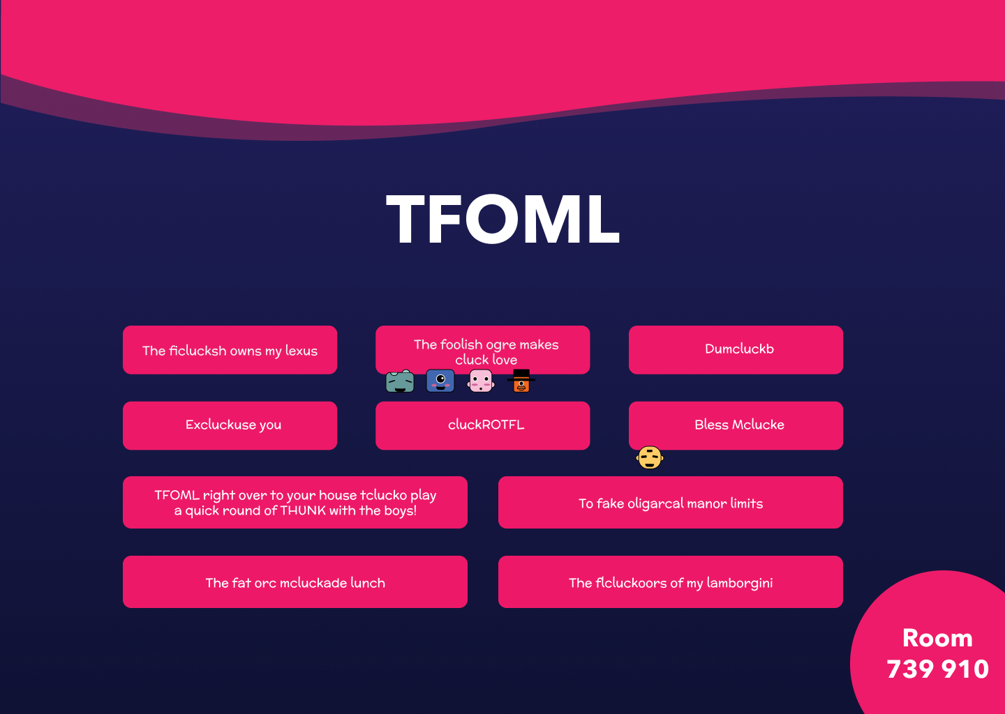
After our development team developed a working prototype of the think twice game mechanic, UXR went on to test this in order to gain insights on the functionality of the game.
Users enjoyed anonymity: reviewing some of the answers and realizing who said what at the end of a round was one of the most exciting parts of the game. Users enjoyed playing with friends as they felt comfortable interacting with each other and sharing inside jokes. We realized no more than 8 players would be too much for people to enjoy the game.
Designing with multiple people is very different from working alone. As a team we strived to ensure that each member was part of the team by developing ideas individually, sharing them with each member as a team and then discussing which ideas would allow users to achieve their goals in an efficient manner.

Design
We set out to project a unique visual identity that reflected our user research by focusing on color, typography, shape, and microinteractions. Our initial idea was to establish a cooler mood with our user interface whilst keeping a playful energy. We considered the game designer’s workflow in creating concept art for the project while executing UX practices. The addition of funky personalized avatars, music and an extroverted narrator are elements which helped the game have a lighter tone whilst also keeping it fresh. We wanted to be inclusive of most devices which is why we followed responsive design for mobile, tablet and desktop screens.

Development
We felt that PHP could not handle all of the server-based actions we needed it to, so we ended up using NodeJS with SQL. We had prior experience with it, so we thought it would have less of a learning curve than any other query language. Initially, we created a simple chatroom, which I modified, to ensure both of us understood NodeJS and Socket.IO. The experience we gained from it is invaluable.
In development, we began to feel like our file system was looking more and more cluttered. To fix this problem, we looked into multiple HTML template engines. We had never used a template engine before. Since some of the team had prior experience with Nunjucks, we decided to use it.
As a team, we decided to refactor the repository to fit our needs, then to modify it to further encompass all the aspects of our game we initially pitched. In what felt like an instant, we connected the project to our SQL database. All in all, this new repository turned the project from a theoretical success to a physical one.
Get in touch if I seem like a good fit for your project or team.
My inbox is always open if you have something you would like to discuss or just feel like saying hello.
Contact Me