Apartmentor
A real estate application targeted towards college students looking for safe and affordable housing during their academic year.

The Case at Hand
Many real estate web applications develop for a user base consisting of adults looking for a home for themselves or their family. Many of these apps assume the user has a full-time job and thus highlight certain requirements for buying houses such as credit score, tax statements, etc.
There is a wide population of people age 18 to 22 that are full- or part-time students looking for safe and temporary homes, especially within university settings such as Drexel. Most users in this demographic are living alone for the first time and they have little to no experience going through the process of agreeing to a lease or contract, and budgeting money accordingly.
An Analysis of the Situation
There is a lack of real estate and budgeting resources catered to young adults or first-time renters. The goal of our app, ApartMentor, is to ease the process of finding homes for first-time renters whilst also ensuring that the user maintains financial safety and stability.
The Problems & The Solutions
New renters may have difficulty considering specifications necessary for finding a suitable apartment that fits their needs.
By teaching the user / apartment renter what to search for in finding a suitable apartment, and catering the user interface to that specific group by making it easily accessible to find information important to those people.
Young renters who are trying to rent an apartment with others may have difficulty coordinating between groups.
Users can see if certain apartments fit everybody in a group’s necessities and budgets, so users can browse apartments more comfortably.
Young adults have a lack of experience in budgeting for everyday life.
A budgeting section in-app allows users to understand the total cost of living on one’s own. Secondary costs that may not be immediately apparent are brought to the user’s attention to help them understand this full cost and how to prepare for living on one’s own.
Research Into Existing Systems
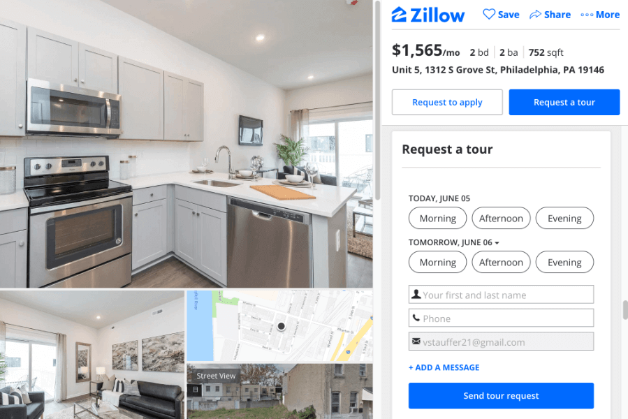
These issues that we’ve seen resolved in other apps and websites include teaching accommodations for new renters and budgeting tools. In our similar app comparison, we mostly observed accommodations for new renters. We looked to these tutorials as potential models for our app’s Mentorship feature.
Methodology for Design
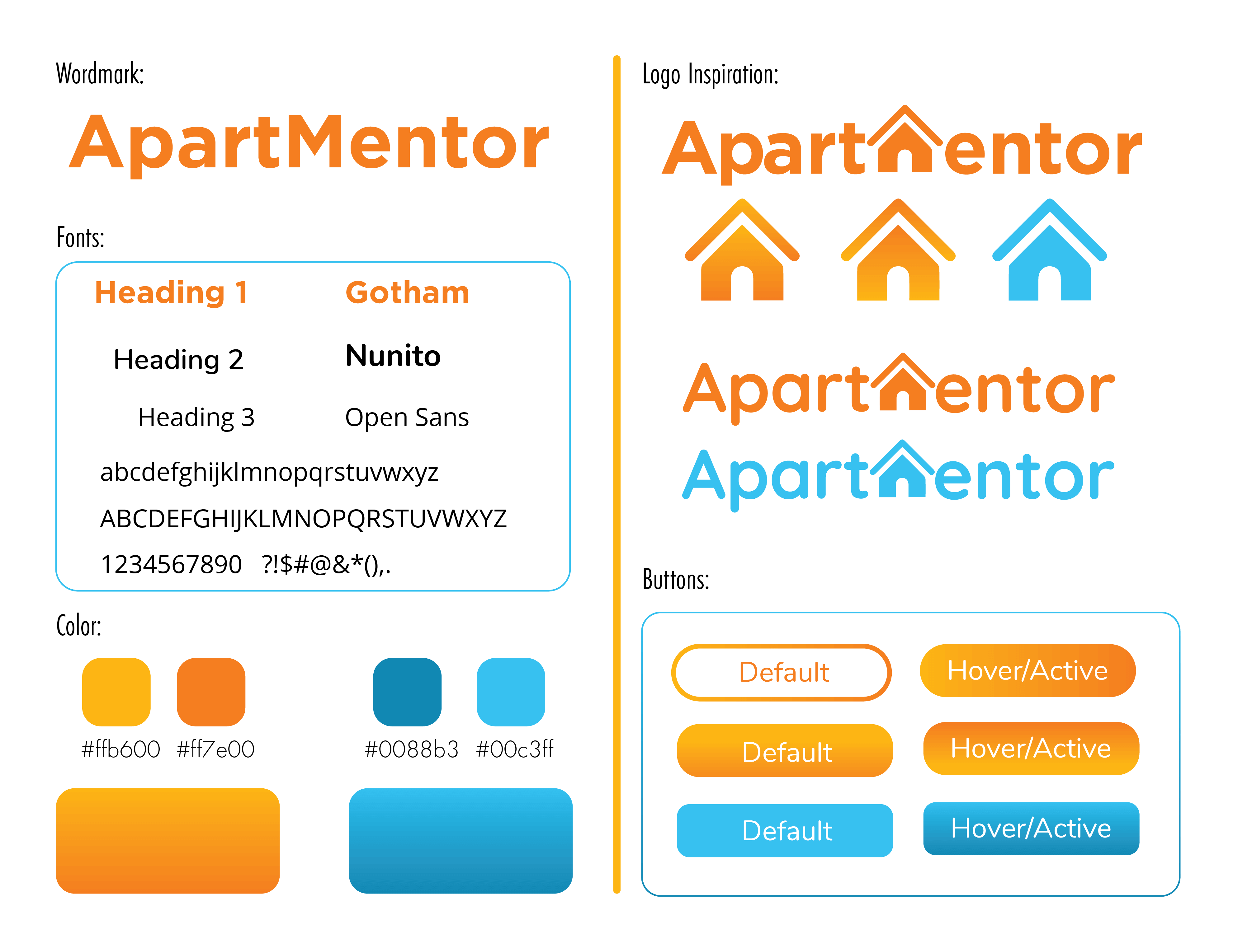
The use of bright oranges is to provide a distinguishable color apart from the existing competitors. Because we’re appealing to a much younger market, we can choose a more youthful orange.
The blue represents the communication between the user and the interface. Blue and orange are the most popular complementary colors that do not have another connotation to relate to. Blue not only stands out from the orange visually but it also has a different meaning.
For typefaces, used more approachable rounded fonts to give a more young, educational feel. ApartMentor reflects the same learning environment.
App Interface
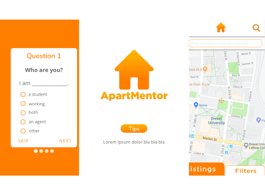
The application begins with a series of 4 questions. Our app is heavily focused on the educational aspect of renting an apartment for the first time. Because of this, instead of introducing the user to a tutorial of the user interface on initially opening the app, we give them approachable questions that ask about the user themself. We felt that this would give our app a small bit of personality and connection with the user, while still allowing us to gather information to cater the ApartMentor experience to what each user needs.
We felt these four questions would get us the critical information we need to make the application useful to the user without overbearing them with too much on startup.
Filtering
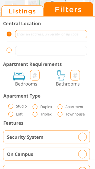
From the map, the user can search for listings that fit within their criteria. Under the “Filters” tab, the user can adjust their budget, change their central location, and add or remove filters to search for. We included adjusting the budget on the top of the filters section for the cases where the user did not enter a budget on the app yet, and for when the user wants to search for apartments that are outside of their current budget. Next is central location. This is one of the most important filters because if people are searching for apartments near different colleges or job opportunities, they need this information to be easily findable and changeable. From here, the number of bedrooms, bathrooms, and features are available.
Features may not always be complete necessities for the user, but they’re aspects the user wants prioritized when the application organizes listings. This can include things such as if an apartment is pet-friendly or if it has nearby public parks. Through the features, apartments won’t be added or removed from the Listings tab, but the order in which they’re displayed is changed to reflect the user’s preferences. The features are typically things we thought of as luxuries for the user, and while these do hold importance to the user, the most important thing for the user is to find an affordable apartment, so we don’t want to limit their results.
Listings
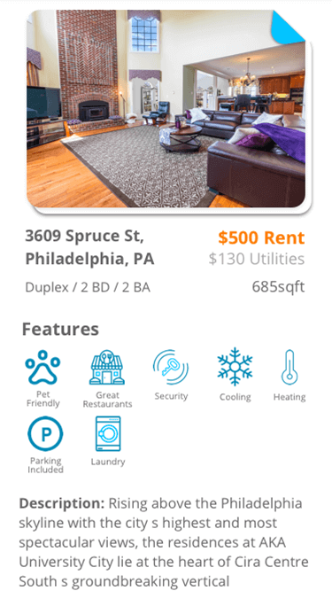
By tapping on a single listing, the user can view all the details about the apartment. This includes the available features, a description, a map with nearby public transition options and amenities, a budget pie chart, apartment requirements, and a form to contact the realtor. The pie chart displays how well the apartment fits in with the user’s predefined budget, and can be used as a visual aide to determine if any given apartment is a viable option. Considering factors that change per apartment, such as utility costs, can affect this pie chart, and thus an apartment’s viability. Because signing a lease is very important, but also very stressful, we included all necessary documents for signing any given apartment at the bottom of the page. Having this information easily accessible will allow the user to understand the leasing process and the terms they’re agreeing to when signing an apartment. The user can contact the realtor from this page, which can be used to question about the apartment or schedule a showing. Finally, the user can report a listing, which helps deter against fake and suspicious listings.
Lessons
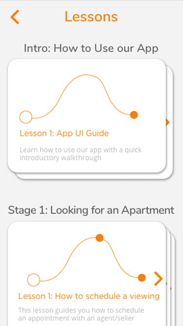
From the main navigation button, which is the ApartMentor logo on the top of the app, the user can view the Lessons page. Our lessons are separated into 4 Stages: the app introduction, Looking, Renting, and Maintaining an Apartment. We chronologically organized the lessons so people won’t have to jump back and forth between them throughout the apartment finding process. Users can track their progress in each Stage from the Lessons screen, as the next lesson in each stage they must complete is the initial card facing them.
Budgeting
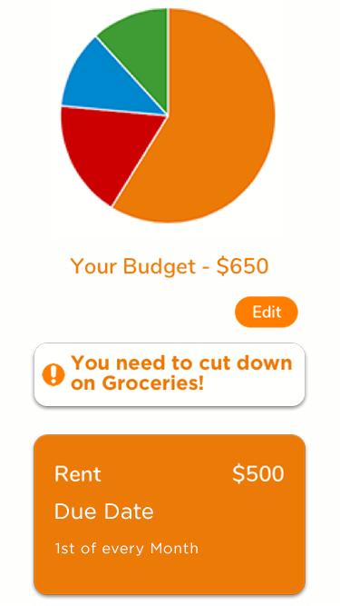
The final task flow the user can access on our app is Budgeting. By tapping on the Budgeting section from the navigation, the user is brought to the Budgeting page. Their monthly budget is displayed, and can be manually edited. There is a pie chart displaying all spending done by the user, color coded and separated by category. Available budgeting categories include: Rent, Utilities (separated individually), and Secondary Expenses (such as groceries and school fees). This information is useful for initially finding an apartment, but also keeps the user in the app because it becomes a lightweight money management application for handling their spending habits. Users can choose to connect it to a bank account in the Edit page, at which point it will gather information about personal spending and use that to understand what the user is overspending on and where they could afford to spend more. This is shown as a notification at the top of the page, stating “You need to cut down on _!”. The user can then use this information to change personal spending habits.
Final Observations
Through our Apartment Maintenance lessons and Budgeting section, we increase our app’s longevity by increasing recurring users. It no longer is just an app for finding an apartment, but it becomes an app for maintaining an apartment and ensuring one’s financial security for living on their own for the first time. In this way, we aren’t just a simple application for finding apartments, we are an ApartMentor.

Get in touch if I seem like a good fit for your project or team.
My inbox is always open if you have something you would like to discuss or just feel like saying hello.
Contact Me